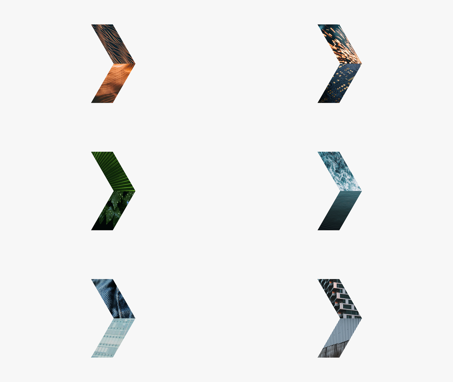
Abstract right-pointing arrow shape filled with textural imagery against a light gray backdrop.

Taseko

/ Brand Refresh
/ UI Design

Taseko is a copper mining company that needed a modernized visual identity and digital experience. The brand refresh builds upon the legacy logo's core arrow element. Reimagined as flexible holding shapes and graphic outlines, the arrow now anchors a clean, contemporary visual system.

Created at WILL
Taseko logo with white bold text and a blue right-pointing arrow on a dark gray background.
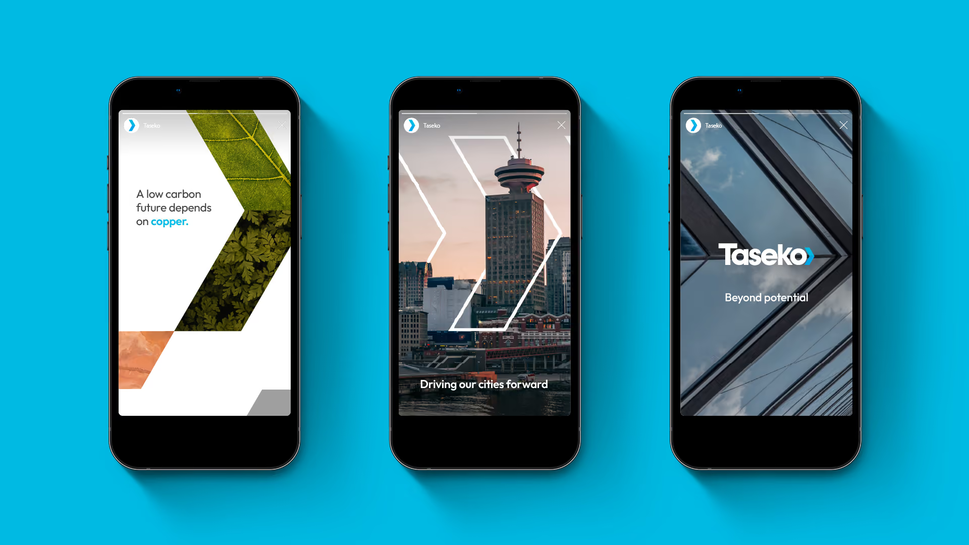
Three black smartphones against a blue background displaying social media designs for Taseko: the first with the text 'A low carbon future depends on copper.' and leaf images, the second showing a cityscape with 'Driving our cities forward,' and the third with the Taseko logo and 'Beyond potential.'
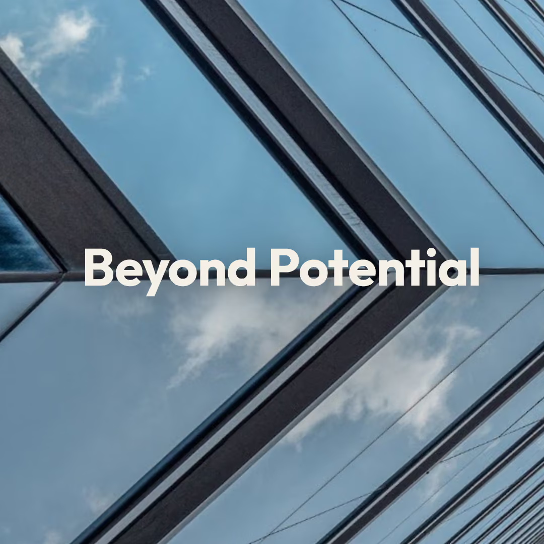
Modern skyscraper with glass windows reflecting the blue sky and clouds, with the words 'Beyond Potential' in bold white letters centred on the image.
Middle-aged man with gray hair and black glasses wearing a green polo shirt looking slightly right with a faint smile, with a blue chevron outline behind him on a white background.
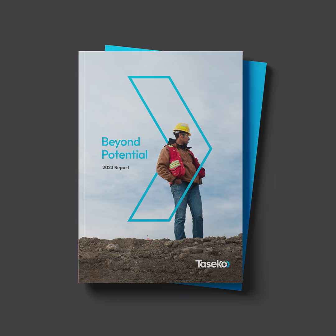
Cover of a 2023 report titled 'Beyond Potential' by Taseko showing a construction worker wearing a yellow hard hat, red safety vest, brown jacket, and jeans standing on rocky ground against a cloudy sky, framed within a blue angular outline.
Close-up of a tire tread pattern imprinted in dirt with a logo: the white word 'Taseko' and a blue arrow-like symbol overlaid in the center.